Auto machine learning

Auto machine learning at PCM17

Last weekend I was at the tenth Pentaho Community Meeting (PCM) in Mainz. It is always a meeting with lots of fun, but also lots of interesting talks and discussion. One of the talk during the last PCM was by Caio Moreno de Souza about Auto machine learning (or autoML). Very simple explained: with machine learning, you give the computer data and it creates and validate a model, so you can predict the ‘future’.

His presentation and discussing about it during PCM17 got my brains spinning at large speed. (As you might now my background is a nice combination of statistics (human science), programming, but rather new when it comes to machine learning).

Auto machine learning processThe data versus business gap

At this moment I think autoML in the sense like above model is not going to work. I think we need some information to determine which algorithm(s) (and parameters to feed these algorithms) to use. But I think autoML or maybe we should call it easyML is needed to fill some gap:

On one side, we have the data guys: very good in manipulation data, actually should have a very basic understanding about statistics (at least measurement level), but are often missing or ignoring this background.

On the other side we have the business guys: they have ‘domain information’, they know a lot about the subject, preferably have some understanding of the data, but especially how it is linked to the subject. They also have at most some basic understanding about statistics.

In between you have the machine learning tools. Even if they are easy to use (like the black box above (hmm autoweka seems to implement this black box)), which is able to select the ‘best’ algorithm), we still have a gap.

The machine learning gap

With a little bit of training/documentation you might be able to let the data guys perform the analysis and to some extend interpret the results. And the business guys should be able to face validate the resulting model. But both of them don’t know which algorithms to choose. You should have some statistical/methodological understanding to choose the proper algorithms. You can not use all algorithms for each problem. Trend analysis needs other algorithms than classification analysis. But maybe more important for some (classification) problems (eg recurrent cancer) you rather not miss recurrence, but if you classify non recurrence as recurrence is not as bad. In this case (eg recurrence of breast cancer): the recall on recurrence event should be high.

The solution

I think it is not desirable/needed to train one of these sides to be able to pick the appropriate algorithms and select the correct parameters. But I think we should be able to create more awareness about the different kinds of machine learning problems and the outcome you wish to optimize, so you can provide information to the black box to create methodological valid and for the business interesting models. But of course the black box should be able to use this information in the model selection. Maybe with Autoweka this is possible, but that I need to investigate

I’m looking forward to help close the machine learning gap and with that the gap between the business guys and the data guys.
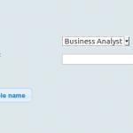
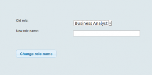
Screenshot: Change Role Name plug-in

Change Role Name plug-in for Pentaho

The current Pentaho BI server (CE 5.4/6.1)  has no option to change the role name. So if you want to change the role name you have to add a new role, add permissions and users to the new role and delete the old role. This is error prone. Using the rest API of the BA-server I’ve created a Sparkl plug-in to easily rename the role name.

Features:Screenshot: Change Role Name plug-in

  • drop down with existing role to select
  • check if source or destination role is missing
  • check if destination role exists (not case sensitive)
  • add permissions and users to new role

Limitation

Because of the duplication check it is not possible to change the cases of a role in a single step. First you need to rename the role to some dummy name. Then you can rename this dummy role to the desired role name with the correct capitals.

The plugin is created using Pentaho BA 5.4 CE, but should work on 6.1 as well.

Installation

The plugin needs admin access to the bi-server. Add the variables P_LOGIN and P_PASSWORD with the credentials of an useraccount with admin rights to ~/.kettle/kettle.properties. The biserver will automatically access this file.

Download

Download the plug-in: changerolename.zip

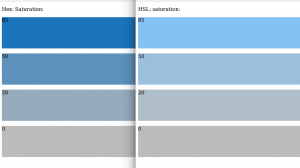
Kleurenrange in hex en hsl equivalent

Kleurenrange bepalen

Het probleem

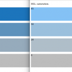
Voor een staafdiagram met meerdere (3 of 4) series wilde ik een kleurenranKleurenrange in hex en hsl equivalentge samenstellen, gebaseerd op een kleur. Via http://htmlcolorcodes.com/color-picker/ kon ik op basis van de hoofdkleur wel een kleurenrange maken, maar het nadeel was dat ik daarmee 8 kleuren kreeg en dat ze daardoor niet onderscheidend genoeg waren. Het simpelweg overslaan van telkens een kleur, leverde niet het gewenste resultaat op.

De oplossing

De intensiteit van een kleur kan makkelijk aangepast worden met behulp van het hsl-kleurenschema. Dit bestaat uit de ‘hue’ (zeg maar de kleur), de ‘saturation’ (de hoeveelheid van die kleur) en de ‘light’ (helderheid). Door de satuaration aan te passen, kan je een ‘lichtere’ variant van de kleur krijgen. De hoofdkleur had een saturatie van 85%. Na veel proberen lijkt een verdeling van de satuaratie 85, 50, 20, 0 het meest onderscheidend te zijn. Nu zou css met hsl kleurcodering moeten kunnen werken (en waarschijnlijk de pentaho charts ook). Maar een eenvoudig testje laat zien, dat in ieder geval bij firefox, de hsl kleurdefinitie veel lichter is dan de hex-equivalent, zoals ik die bepaald heb met een grafisch programma. Ik ben wel benieuwd waar een grafisch ontwerper mee zou komen.

PDI python executor

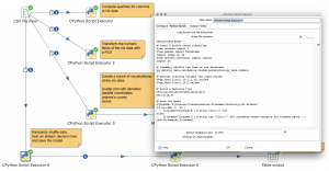
One of my clients has a python script to validate incoming data files. One important feature is to test the HashCode of the file, to investigate if it is a legitimate file. Of course it would be possible to convert the python script to a Pentaho pdi transformation, but why not use the existing script.

Installation

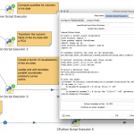
pdi python executorPDI has a plugin called Cpython Script executor, which is developed in the pentaho labs. It is installable via the Marketplace. But unfortunately it did not mention the requirements to execute a python script. Luckily it was on the documentation provided within the github repository. It needs Pandas and Sklearn. Knowing a little bit about python I tried to install it using pip. But on my Ubuntu laptop that did not work. I did not manage to install sklearn. So a little browsing brought me to http://scikit-learn.org/stable/install.html with the suggestion to install Sklearn using the Linux repositories. So I did (and removed the pipped install pandas and install it from the linux repo). After that I was able to run the sample pdi transformations provided by Mark Hall.

First results

The cpython script executor is targeted to data scientists. And I guess it is of great value to manipulate big datasets or complex calculations. However for my purpose it seems rather slow. I tried a simple transformation which reads 10 rows with one variable containing the value ‘pietje’. The python script check if the value was ‘pietje’. If so, it returns 1, else 0. It takes about 6 seconds to complete. So a more difficult script with more data probably needs a different approach.

Dataverzamelen met audiocodes

Mobiel data verzamelen via audio codes: De toekomst is al voorbij

Toekomst?

De toekomst voorbijScene uit de film Minority Report: Anderton vlucht weg, nadat er een voorspelling is gedaan dat hij een moord gaat plegen. Onderweg komt hij langs veel plaatsen waar hij gepersonificeerde aanbiedingen krijgt. Een mooi manier om te laten zien, dat vluchten eigenlijk geen zin heeft, want men weet waar je bent…. Verre toekomst? Nou, niet meer.

Dataverzamelen via audio codes

Vandaag hield Tim Farmer van Ipsos een interessant maar ook angsaanjagend verhaal oMobiel data verzamelen met audiocodesver data verzamelen via de mobiele telefoon. Ze hebben een app ontwikkeld, bedoeld om te onderzoeken of de bezitter in contact gekomen is met een bepaalde reclame-uiting. Aan de reclame-uiting is namelijk een audiocode toegevoegd die door de luidspreker van de telefoon opgevangen wordt. Hierdoor is bekend, wanneer, hoe vaak en waar iemand in aanraking is gekomen met de reclame. Bij de pilot is aan het eind van het traject een vragenlijst afgenomen om meer te weten te komen over het merkbeleving en de neiging om het product te kopen.

Uitkomsten

Een interessante uitkomst was dat de mensen die wel in aanraking geweest waren met de uiting, maar dat zelf niet (meer) wisten, een positievere merkbeleving hadden, dan de mensen die niet in aanraking waren gekomen (en dit ook correct aangeven). Mensen worden dus (onbewust) beinvloed door de reclame.

Voordelen

Op zich een mooie manier van onderzoek doen, de deelnemer is zich niet bewust wat er onderzocht wordt en er is dus minder bias. Hij hoeft er geen extra inspanning voor te doen (behalve zijn telefoon altijd bij zich te hebben) en de data is direct beschikbaar. Je zou het bijvoorbeeld ook kunnen gebruiken om de reclamecampagne te beeindigen als meer dan 70% de reclame meer dan 5 keer gehoord heeft, eventueel zelfs met een aantal condities, zoals dat er weinig voorgrondgeluid was.

Vraagtekens

Aan de andere kant… Zo’n app verzameld aardig wat informatie over de gebruiker, en kan in potentie je hele leven registreren. Het vraagt veel vertrouwen in de onderzoeker of naiviteit van de gebruiker. Ik ben benieuwd of dit een onderzoeksmethode gaat worden, die breed ingezet kan worden in een dwarsdoorsnee van de bevolking. En als dat zo is, hoe de deelnemers verleid gaan worden om mee te doen. Een incentive van 20 eur om 3 maanden gevolgd te mogen worden, lijkt mij niet voldoende.

Table component with improvements

Weekly statistics with Pentaho Dashboard

A sortable table component with weekly statistics sounds quite easy. However….

Information need

A customer of Susteq wants to sell water jerry cans of 1, 5 and 20 liters. They like to know the weekly sales for each of this jerry cans (number of jerry cans and total amount of water). A table component would be a good instrument to visualize this data, with the sales of the past X weeks.

Problems

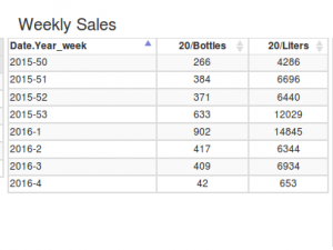
  1. To be able to sort the data per week, the datum should have Weekly statistics table without improvementsa format like 2016-08. But the Mondrian query could not return this, because of the use of currentDateMember and the Visual Basic formatting only implements week number without leading zero.
  2. When does week number 1 starts?
  3. In a period (or for certain water sales units) not all different jerry cans are sold, so the number of columns varies so different number of columns
  4. No hierarchy in table header, default row headers look like 1/Bottles, 1/Liters, 5 Bottles, 5 Liters,20/Bottles, 20/Liters

Solution

Database and query (1,2)

In the database/datamodel is a date dimension with two fields containing year and week. Both are of type integer. These are used as level in the hierarchy. We also have an string column year-week with leading zero. We use this field as ordinalColumn at the week level (unfortunately we could not use this field as caption column to display to the user, since it is not implemented yet in cde. To fill the database we used the ISO8601 calculation of week and YEAR. Thanks to Diethard, we could know query the data with something like:

SELECT NON EMPTY CrossJoin([~COLUMNS], {[Measures].[Bottles], [Measures].[Liters]}) ON COLUMNS,
NON EMPTY LastPeriods(${param_period},     CurrentDateMember([Date], ‘${param_date}’))
ON ROWS
With $param_date: [“Date.Year_week”]\.[yyyy]\.[ww]

Adjusting week number string (2)

To add the leading zero we define the type of first column (with the week number) as formattedText and add the leading zero if it has a length of 9 (or less)

  //week number with leading zero
    this.setAddInOptions("colType","formattedText",function(cell_data){
        var tempCell= cell_data.value;
        var tempDate=tempCell.split("-");
        if(tempDate[1] <=9){
            return {  textFormat: function(v, st) { return tempDate[0]+"-0"+tempDate[1]; } };
        }
         else {
            return { textFormat: function(v, st) { return tempDate[0]+"-"+tempdate[1]; }  };
            }  
      });

Different number of table columns (3)

To solve the dynamic number of columns we add some javascript code as pre-execution script as suggested on the pentaho forum:

//reset col headers
    this.chartDefinition.colHeaders = [];
    //this.chartDefinition.colTypes = [];
    this.chartDefinition.colFormats = [];

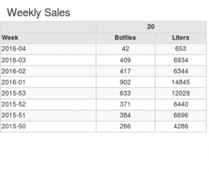
Weekly statistics table with improvementsIt is not necessary to reset the colTypes and we need it for the columnHeaders adjustment. This solution has a disadvantage: when there is no data, it returns an “Error processing component”, caused by this.chartDefinition.colHeaders.  I have not yet found a solution for this problem.

Sub columns/ hierarchy in column headers (4)

Again  based on a post at the Pentaho forum, we add some javascript code as postExecution script to add a table header row which contains the group label (1, 5, 20) and changed the existent header row to remove this group label):

function() {
    var nrcol=2; //number of columns in the group (Bottles and Liters)
    var firstHeader="Week";
    var thpart = "";
    var cells = $( "#" + this.htmlObject + " thead th " );
    cells.each(function(i, v) {
        if( i > 0 ) { //skip the first cell of each row
            var cell = $( v );
            var originalText = cell.text();
            var originalTextParts = originalText.split( "/" );
            if (i%nrcol==0){
                thpart=thpart+"<th class=\"thspan\" colspan='"+nrcol+"'>"+ originalTextParts[0]+"</th>" ; 
            }
            cell.text( originalTextParts[1] ); 
        } else {
            var cell = $( v );
            cell.text(firstHeader);
        } 
    });
     var newHeaderRow = "<tr><th></th>"+thpart+"</tr>";
    $( "#" + this.htmlObject + " thead" ).prepend( newHeaderRow );

    //add some style...
    $( "#" + this.htmlObject + " thead th" ).css( "border", "1px solid #DEDEDE" ).css( "background", "#E6E6E6" );

}
Evolution over period with annotations

Google analytics records blog posting (test)

Nerd alert:
If we want to interpret web statistics it is useful to have information when important events happened. Such an event is the date a new blog post is published. I use Google Analytics and Piwik next to each other, mostly for testing and comparing. Both Google Analytics and Piwik have ‘annotations’. These can be used to analyse your data. However….

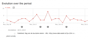
The connection between this WordPress site and Piwik is handled by the plugin WP-Piwik. This plugin is responsible for recording website visits. But it is also possible to automatically send an annotation to Piwik if a new blog post is published. These annotations are for instance displayed in the ‘Evolution over the period’ graph on the visitors overview page. You can easily see when a certain post is published and compare this with the user visitsEvolution over period with annotations statistics (see graph).

Google Analytics also have annotations, but unfortunately the Google Analytics API does not seem to have a method (yet?) to receive these annotations from an external source (you could add these manually each time you publis a post, but who is going to do this?) A work around is provided with the WordPress plugin Google Analytics Internal. It should trigger an Analytics event when we publish a post.

This morning I installed this plugin and now it is time to test to see if it is working and to investigate how we can use these event to get a better insight of the influence of certain blog post to website visits

Results in Google Analytics

It took a while, but via custom reports I’m able to display the publish event and the page visits at the same time. And I could investigate which events took place. But it needs some further investigation to see if we can tailor this more to my wishes…. (and some more time to display the graph with the effect of this blogpost)Visits last week and publish event recording

Dag van de normalisatie: Leeftijd bij het CBS

Vandaag is het de dag van de normalisatie. Simpel gezegd houdt normalisatie in dat er normen afgesproken zijn, zodat bijvoorbeeld alle electrische apparaten in Nederland (en veel andere landen) die werken, rekeninghoudend met voltage en al dat soort technische zaken en natuurlijk een passende stekker hebben.

Helaas zijn er verschillende normen die gehanteerd kunnen worden. Zo is het stopcontact in het Verenigd Koninkrijk net anders dan die in Nederland. Maar door de normen, kunnen er gelukkig wel weer verloopstekkers gemaakt worden om dit op te lossen. Vervelender vind ik de wildgroei aan stekkers en voltages voor laders (en accu’s) van laptops. In al die jaren heb ik nog geen enkele keer een lader van een eerdere laptop kunnen gebruiken. Ook de kans dat je iemand zijn lader kan gebruiken is behoorlijk klein.

Ook bij het doen van onderzoek is normalisatie erg belangrijk. Zonder normalisatie is het lastig om data van het ene onderzoek te vergelijken of te gebruiken bij ander onderzoek. Ik heb de proef op de som genomen bij de indeling van leeftijd zoals die door het CBS gehanteerd wordt. Ik heb op http://statline.cbs.nl gezocht op leeftijd en van de eerste 20 resultaten gekeken welke leeftijdsindeling gebruikt wordt/kunnen worden in de rapportage. Ik heb er 12 verschillende gevonden. Deels is dit wel logisch. De leeftijd bij onderzoek onder basisschoolkinderen is anders opgebouwd dan bij onderzoek naar de werkende bevolking. Maar anderen zijn vrij onhandig gekozen. Het combineren met andere data wordt dan vrij lastig. Vaak zijn wel andere indelingen aanwezig (5 jaarsgroep of 10 jaarsgroep). Maar de indeling die gehanteerd wordt bij Leefstijlonderzoek is erg afwijkend en slecht vergelijkbaar met andere onderzoeken:

  • 4-12 jaar (8 jaarsgroep)
  • 12-16 jaar (4 jaarsgroep)
  • 16-20 jaar (4 jaarsgroep)
  • 20-30 jaar (10 jaarsgroep)
  • 30-40 jaar (10 jaarsgroep)
  • 40-50 jaar (10 jaarsgroep)
  • 50-55 jaar (5 jaarsgroep)
  • 55-65 jaar (10 jaarsgroep)
  • 65-75 jaar (10 jaarsgroep)
  • 75 jaar of ouder

Dag van de duurzame eieren

Vandaag is het de dag van de duurzaamheid en de internationale dag van het ei (*). Het leek me leuk om deze twee te combineren. Een interessante vraag is dan: Hoeveel eieren worden er duurzaam geproduceerd en wat is de trend daarvan. Het vinden van data viel me erg tegen. Het CBS publiceert alleen over het aantal bedrijven en aantal dieren en maakt alleen onderscheid tussen totaal en biologisch. Ze publiceren dus niet apart over bijvoorbeeld vrije uitloop, scharrel- en kooieieren.  Het productschap vee, vlees en eieren publiceerde wel een overzicht. Maar deze is opgeheven per 1 januari 2015, dus zijn hier ook geen recente cijfers te vinden. Ook veel andere ‘ei’-organisaties zijn moeilijk online te vinden of hebben geen data.

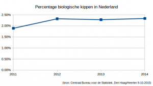
De beste gegevens die ik gevonden heb, zijn dus het aantal biologische leghennen als aandeel van alle leghennen voor de periode 2011-2014. In onderstaande figuur is te zien dat dit percentage iets meer dan 2% is. Er lijk 2012 een kleine stijging gerealiseerd te zijn. Als ik meer tijd kon besteden, had ik mogelijk ook informatie over vrij uitloop en scharreleieren kunnen vinden. We zouden dan een beter beeld hebben van de productie (en daarmee het gebruik) van duurzame eieren.

dag van duurzaamheid: percentage biologische leghennen in Nederland


* ) De komende tijd zal ik vaker een post doen geïnspireerd op de ‘Dag van…..’. Bijna elke dag is het wel een bijzondere dag. Een mooi overzicht is te vinden op: http://www.fijnedagvan.nl/. Ik zal er een aantal kiezen om een data-gebaseerde post te schrijven. Daarbij zal ik wel steeds vanuit een vraag vertrekken.

Dashboard watergebruik

Reliable water access with Susteq

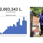
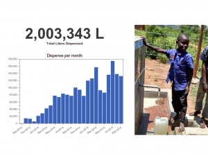
Susteq, een van mijn klanten, maakt betalingssystemen voor watertappunten in Kenia (en binnenkort Tanzania). Door het water letterlijk betaalbaar te maken, is er geld beschikbaar om het punt te onderhouden en dus in gebruik te houden. Bijkomend voordeel is dat er ook gemonitord wordt hoeveel water er getapt wordt en door hoeveel mensen. De afgelopen tijd ben ik bezig geweest om deze data om te zetten met behulp van Pentaho en in een dashboard weer te geven, zodat bekeken kan worden welke waterpunten goed werken. Vlak voor de oplevering is er toevallig een mijlpaal gehaald bij hun pilotproject. In totaal was er 2.000.000 liter water getapt. Dat klinkt naar een enorme hoeveelheid water en de mensen hebben ondertussen al twee jaar betrouwbaar drinkwater. Maar hoe lang zouden wij, in Nederland, daar eigenlijk mee toe kunnen. Volgens een van de grafieken komen er elke maand  ongeveer 100 gebruikers water halen (ongeveer 500 mensen). Volgens de website van Vitens gebruiken wij in Nederland 119 liter per persoon per dag. Een snelle rekensom leert dat we met 500 mensen binnen 33 dagen die 2 miljoen liter water verbruikt hebben……

Wat kunnen wij met de hoeveelheid water die zij per dag per persoon gebruiken

Watergebruik in KeniaIn augustus 2015 is er bijna 138000 liter door 98 unieke gebruikers getapt. Dat is 9 liter per persoon per dag. In werkelijkheid is dit zelfs minder, omdat er ook een paar waterverkopers water halen bij deze tappunten. Er zijn 3 gebruikers die significant meer water tappen dan gemiddeld (>200 liter per dag). Gezien de hoeveelheid water die zij tappen, zouden zij zo’n 150 mensen bedienen. Het gemiddeld gebruik per persoon per dag komt dan op 7 liter, dat is nog geen minuut douchen bij ons… Met zo weinig water zouden we ons watergebruik drastisch moeten aanpassen.